I have a running list on my Notes app titled “The 20-Second Rule.” It’s a list of apps that take longer than 20 seconds from the moment you tap the icon to the moment you reach the actual, functional interface. If you’re a developer, you might think 20 seconds is nothing. If you’re a user—or a UX writer who has spent 11 years watching people bounce because they got bored during an onboarding carousel—you know that 20 seconds is an eternity. It is the difference between a loyal user and a deleted app.

But recently, I’ve found that the "20-Second Rule" isn't just about loading speeds. It’s about why we stay. More specifically, it’s about why we feel physically pulled back into apps that offer “live” experiences. Why do we check our phones for live updates even when we know nothing has changed in the last five minutes? Why does the prospect of a livestreaming event feel like a social obligation?
The answer isn't just "human psychology." It’s a calculated, brutal, and highly effective evolution of mobile UX design.
The Smartphone-First Imperative
We are a species that has optimized our lives for the five-inch screen in our pockets. As someone who tests mobile sites on the worst possible public Wi-Fi—I’m talking about that one spot in the back of the train car where the bars drop to a single flickering dot—I can tell you that "live" features are the ultimate test of an app's structural integrity.
The best "live" apps don't just push data; they prioritize smartphone-first accessibility. They understand that if you’re trying to participate in a real-time chat while standing in a coffee line, you don't have the bandwidth for heavy, bloated assets. The UX teams behind the most successful apps have figured out that "live" has to mean "instant." When a feature loads fast, it creates a feedback loop. You tap, you see the feed, you feel the immediate hit of information. If it lags, the magic breaks. If it loads in under a second, you’re hooked.
The Psychology of Instant Access
There is a specific kind of frustration reserved for slow loading screens with no progress feedback. We’ve all seen them: the generic spinner that tells you absolutely nothing. But compare that to a well-built "live" interface. These apps are designed to hide the technical heavy lifting.
How "Live" UX Patterns Compare to Static Design
Feature Element Static App Pattern "Live" App Pattern Content Delivery On-demand request (pull to refresh) Websocket-driven push (auto-update) User Friction High (manual check) Low (passive observation) Dopamine Trigger Delayed reward Immediate pulse UX Goal Task completion Extended session timeAs the table suggests, the "Live" pattern is designed for convenience as a loyalty driver. It removes the mental effort of "Do I need to check this?" and replaces it with "This is just happening, so I’ll watch." It’s passive consumption that feels like active participation.
The Fear of Missing Out (FOMO) as a Design Feature
We have to talk about the elephant in the room: fear of missing out. In my early days writing copy for paywall screens, we obsessed over "scarcity." How do we make the user feel like they need to subscribe now? The answer was always a countdown timer. Real-time features are essentially countdown timers that never end.
When you are in a real-time chat, the ephemeral nature of the conversation acts as a hook. You aren't just reading text; you’re witnessing a moment. If you leave, you lose the context. If you close the app, you miss the punchline. Product teams know this. They bury the logout button deep in the settings menu not just to annoy you, but to make the act of leaving a deliberate, multi-step choice rather than a reflex.
The Cost of Convenience
We are often told that apps are "convenient." But is it convenience, or is it frictionless entrapment? Let’s look at the lifecycle of a modern "live" app:
Onboarding: Fast, frictionless, and promises immediate value. Retention: Uses push notifications to bridge the gap between sessions. The "Live" Hook: Draws you in with a time-sensitive event or a stream. The Loop: Reinforces the behavior until the app becomes your default "boredom killer."I’ve noticed a pattern in my own behavior: I only feel the "pull" when the UX is seamless. When the app is slow, or when the "live" feature requires me to jump through hoops to see the actual content, my FOMO evaporates. The magic of "live" is fragile. It relies entirely on the speed at which it can deliver the promise of relevance.
A Cynical Look at Marketing Claims
https://highstylife.com/the-notification-tightrope-how-smart-platforms-balance-relevance-and-retention/One of my biggest professional pet peeves is vague claims in marketing language. You’ll see apps bragging about "Real-time engagement!" or "Hyper-connected experiences!" without explaining how that actually benefits the user. Usually, it’s just a fancy way of saying, "We have a feed that updates automatically."
As a user, you should be asking: *What is this feature actually doing for me?* If it’s just providing live updates on something that doesn't affect your life, it’s just noise. But if it’s facilitating connection—like a live chat during a broadcast or a shared experience—that’s where the value lies. The problem is that UX design is so good at mimicking that value that we often can't tell the difference between a useful connection and a manufactured craving.
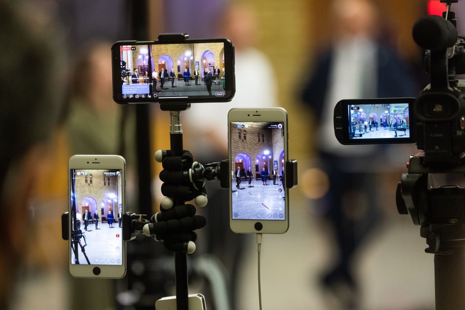
The Future of the "Live" Habit
Where does this lead? We are moving toward a web that is perpetually "live." We are trading the structured, static pages of the past for an infinite, scrolling, pulsing stream of now. This is great for the platforms—session times go up, engagement metrics soar, and ad revenue follows. But for the user, it’s a tax on our attention.
My advice? Start noticing the triggers. Next time you feel that itch to open an app, ask yourself: *Did I come here for something specific, or am I being pulled by a notification about something happening "live"?*
Test your apps. If they take forever to load, if they bury the logout button, or if they rely on vague, overhyped marketing to keep you in the loop—delete them. Reclaiming your attention starts with realizing that "live" is just a feature, not a life requirement. And if you find yourself unable to stop, just remember: you are the customer, not the content. Or at least, you should be.
Final Thoughts for the UX Minded
- If you're a designer: Focus on the "Time to Interaction." If it takes longer than 2 seconds to see the "live" content, you've already lost the user's focus. If you're a writer: Cut the fluff. "Real-time interaction" is a buzzword. Tell the user *why* they need to be there right now. If you're a user: Check your screen time. If a "live" app is taking up 40% of your daily average, it's not a utility—it's a habit.
I’ll be here, testing the next batch of apps on my weak-signal train commute. I’ll keep adding to my list, and I’ll keep wondering why we are so eager to let our phones dictate what "now" https://bizzmarkblog.com/why-do-i-keep-getting-pulled-back-in-by-live-features/ means.